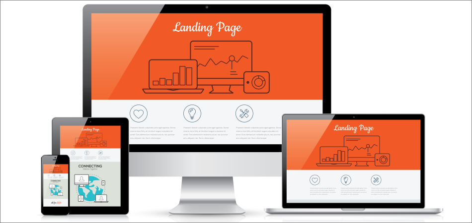
MY BLOG
HOW TO CRAFT THE PERFECT LANDING PAGE
Many companies have built solid businesses by creating easy to use landing page builders. Don't take my word for it; here's a list which showcases the most popular ones. So, it's quite easy to miss the mark by simply dragging and dropping some elements onto a blank page, and then wonder why the results are disappointing. Follow the guidelines highlighted below to make sure that these things don't happen to you.
1. Craft a relevant message
Way too many people build a single landing page, and then display it everywhere. You need to create a dedicated landing page for every essential product or service that you are selling. By doing this, you will be able to address your audiences' most common, laser-targeted problems, rather than displaying a vague message, which doesn't make people take the desired action.
2. Create a simple layout
Lots of entrepreneurs want to capture as many details about their website visitors as possible. So, they create those long, boring forms which never get filled in, because people aren't prepared to disclose that much information about themselves.
To make landing pages work for you, and not against you, be sure to use a simple layout, which includes the necessary information, and then asks people to input their email address and name in exchange for a precious digital resource, a discount, etc.
I know that sometimes you will need to create a long form. If this is the case, be sure to split it into several multistep forms. By doing this, you will make it easier for people to fill in all the needed information, and you will increase conversion rates.
Any and all distracting design elements must go! Get rid of any pop-ups, videos that start playing on their own, chatbots who try to entice people to make a purchase, and so on.
While there is no perfect solution that works for any industry in the world, it has been proven time and again that single column landing page layouts provide solid conversion rates, so be sure to use them.
3. Use a powerful call to action
Many beginners make the mistake of thinking that it's all down to using that big red button for your calls to action. In fact, you need to pay attention to the text that is placed before that button, as well as at the text on the button itself.
Your call to action should have a single purpose: to compel website visitors to take the desired action. To achieve this goal, you will need to capture their attention first. So, rather than focusing on the product's features, be sure to emphasize what's in it for your potential customers. In other words, how will their lives become better and/or easier by filling in your lead generation form? How are you going to fix their pressing problems?
If your message is powerful and compact, you will have the opportunity of placing your call to action close enough to the top. I see lots of designers placing their CTAs way too far down the page, and this will significantly reduce conversion rates.
4. Keep mobile users in mind
More and more people utilize mobile devices to access the Internet these days. Don't quote me on this, but I'm pretty sure that desktop computers will die a slow death within the next decade or so. So, ensure that your landing pages look great on mobile devices as well.
5. Don't forget about A/B testing
Just because your landing page has a stellar conversion rate of 10%, it doesn't mean that it can't be improved even further. Most landing page builders integrate analytics, so be sure to use this feature. Alternatively, you can easily add Google Analytics to any landing page.
Once that you've got a website analytics system in place, it's time to experiment with font sizes, text positions, CTA button colors, and so on.